


Autumn in Kyoto – Alex Syberia Designs for Spellbinders

What a gorgeous collection! Alex Syberia Designs has captured the beauty of Autumn in Japan with the Autumn in Kyoto collection for Spellbinders. The combination of intricate gold-foiled details, warm Autumn colours, and adorable Japanese-inspired dolls makes this collection an absolute delight to work with.
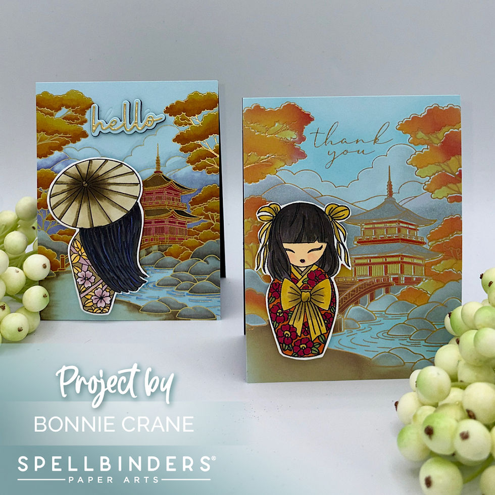
I created two cards using the Autumn in Kyoto Clear Stamps and coordinating Press & Foil Plates. Although both cards feature the same beautiful foiled background, I coloured them in two different ways. For one card, I used the coordinating stencil set with Distress Oxide inks, while the second background was coloured entirely with Copic markers. It’s always fun to see how differently the same design can look with a change in colouring technique.
SUPPLIES
Card Details
Foiled Backgrounds
I began by foiling the background images using the Autumn in Kyoto Press & Foil Plates and gold foil on Windy cardstock from the Colourwheel cardstock collection. The pale blue cardstock provides a lovely backdrop for the gold detailing and creates a beautiful contrast with the rich Autumn colours.
For both cards, the dolls were stamped onto white cardstock, coloured with Copic markers, and fussy cut. I used foam squares to pop up the dolls, adding dimension and making these sweet images stand out against the detailed backgrounds.

Card One – Stencilled Background
For the first card, I used the coordinating stencil set to colour the foiled background with Distress Oxide inks.
The foliage was coloured with Candied Apple, Wild Honey, and Scattered Straw. I used Hickory Smoke for the rocks and clouds, while the mountains were coloured with Hickory Smoke and Milled Lavender. Mermaid Lagoon added colour to the sky and water, and Vintage Photo was used for the foreground. The pagoda was coloured with a combination of Hickory Smoke, Candied Apple, and Wild Honey.
For the adorable doll, I chose a rich, colourful kimono that complements the autumn scenery. Here are the Copic markers I used:
● Kimono: R37, R18, YG63, Y28, Y26
● Hair: W6, W9, V17
● Skin: E51, E93
● Bow: Y26, Y28
I love how the warm colours of the kimono tie in with the golden foliage and the rich tones of the pagoda. The stencilling makes colouring the detailed background quick and easy while allowing the beautiful gold foiling to shine through.

Card Two – Copic-Coloured Background
For the second card, I coloured the entire background with Copic markers instead of using the coordinating stencils. This approach gave me the freedom to blend the colours and add variation throughout the scene.
Here are the markers I used for the background:
● Trees and shrubs: Y27, YR14, YR35
● Pond: B23, B000
● Rocks: W2, W3, W5
● Clouds: C0, C000, 0
● Pagoda: YR27, R35, R37, YR14
● Mountains: BV00, BV11, 0
The warm oranges and golden yellows create a beautiful Autumn landscape, while the soft blue water and pale mountains balance the richer colours. The gold foiling adds definition to the intricate details and gives the entire scene a lovely finish.
For the doll, I used a softer combination of colours for her kimono:
● Hair: W8, W9, BV08, 110
● Carousel: E84, B81
● Kimono: RV91, RV93, YR31, YR38
The dark hair and pink kimono provide a lovely contrast against the warm Autumn background. Once again, I used foam squares to add dimension to the finished image.
Closing Thoughts
I had so much fun creating these two cards with the Autumn in Kyoto collection! The gold-foiled backgrounds are beautiful, and I love how the same design can take on a different look depending on the colouring technique.
Using the coordinating stencils is a great option when you want a quicker way to add colour to a detailed background. On the other hand, colouring with Copic markers allows you to customize the shading and blending for a more hand-coloured look. Both techniques work beautifully with these Press & Foil Plates, and I think the sweet dolls are the perfect finishing touch.
Comments